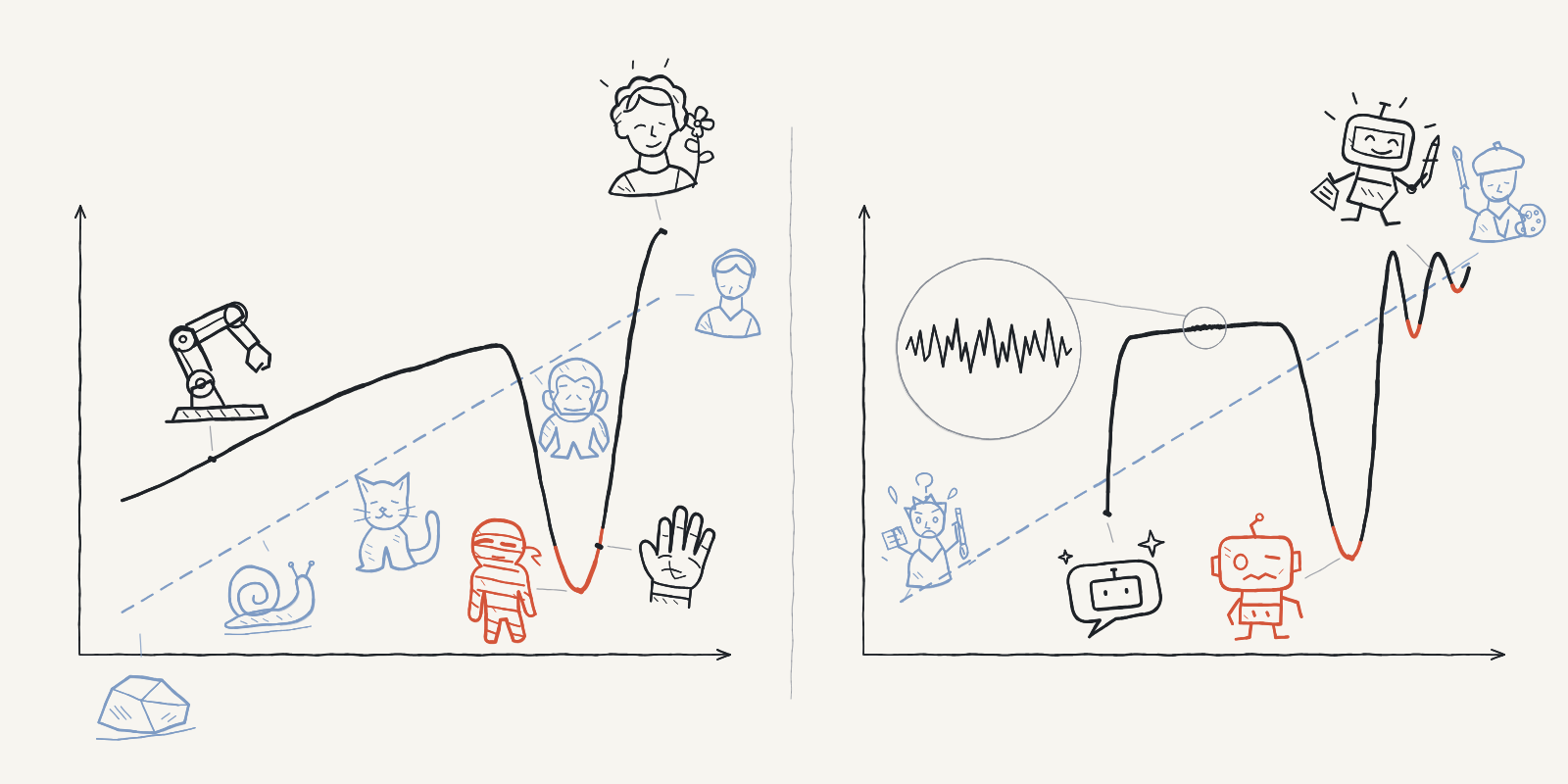
The AI Look Is an Uncanny Valley of Taste
Beauty doesn't need decimal-point precision
This version was translated with AI assistance and is still being reviewed by the author, so some wording may change.
This piece grew out of building my personal website over the past two weeks. A lot of questions I'd never quite figured out finally took shape once I was doing the actual work.
The article went through a few rewrites, too. At first I wanted a rigorous argument, or at least a tidy summary, but my own opinions and stories kept sneaking in, and at some point I stopped fighting it. So think of this as a long, wandering chat rather than an essay.
First published in Superlinear Academy.
Translated from the Chinese original with AI assistance. Links to Chinese posts are in that version.
About 4,200 words, 9 images, 17 minutes to read.
Since AI showed up, designs, websites, and videos have multiplied. I'm guessing most of you have tried building a website with AI by now, and the results are usually decent. But do it a few times and you start to feel it: The thing has an AI look, and you can't quite put your finger on why.
In my earlier post, A Community Gardener's Side Project: Building a Personal Website as a Graphic Designer, I wrote one line like this: I don't buy that people genuinely can't tell when something screams AI. So let's continue from there. Where does the AI look come from, and can we explain it?
This has been on my mind for the past couple of weeks. Last weekend I fell down a rabbit hole of AI videos, and when people in the comments brought up the uncanny valley, it clicked: AI and that idea are closely linked.
1A "specialized" uncanny valley
My short answer: The AI look is essentially a specialized version of the uncanny valley.
Comparing AI to the uncanny valley isn't new. I got here on my own, but when it comes to AI-drawn faces or AI-built interfaces, I'm definitely not the first. What I want to do is take the comparison apart properly and explain why I call it a specialized uncanny valley.
Most of you have probably heard of it, but here's the quick version just in case. The Japanese roboticist Masahiro Mori proposed it in 1970: The more a robot looks like a human, the more we like it. But once it gets very close and still misses by a little, that liking falls off a cliff and it starts to creep us out. Only when it's nearly indistinguishable from a real person does the warmth come back.
One detail worth noting: In Mori's original essay, the example near the bottom of the valley is a "prosthetic hand." It looks just like a real hand, until you shake it and it's limp, cold, and boneless. At the very bottom sits a "corpse," directly opposite the "healthy person" at the peak. The dead-eyed faces we picture today weren't in the original at all. They came later, from people's own experience.
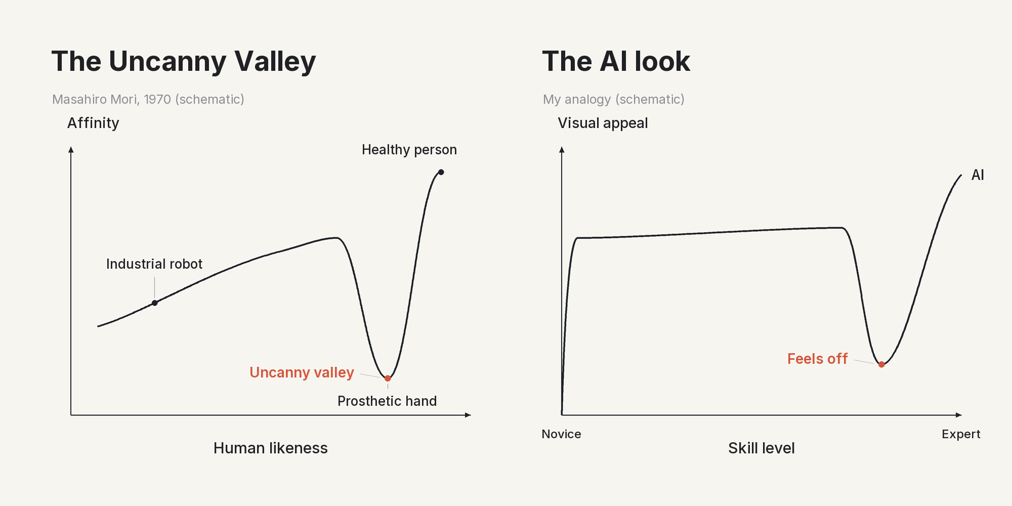
AI-made visuals work the same way: They look very close to the best work, but never quite close enough. Your eyes might miss it, but your gut already knows.
Something Feels Off, but You Can't Say Why
I've never been anti-AI. If anything, I'm team tools: Any technology that helps people work faster and make more, even in creative fields, doesn't steal the creator's voice in my book. But the problem is real. When most people look at something AI made, they quietly sense that something is off, and they can't say what.
I think the core reason has nothing to do with AI. It is a deeper question, the kind you see in literary criticism or art appreciation: You need to know why a good piece of work is good. Kedaibiao, the founder of Superlinear Academy, has made a similar point: Being able to "tell at a glance whether something is good" is the ability that is hardest to replace. If all you can do is copy the surface, you end up with cargo-cult design: Every part is in place, and none of it quite works. That's how unsettling work gets made, and that's where the uncanny valley comes in.
So why do machines trigger the uncanny valley at all? Dig deep enough into psychology and biology and you'll find things like a built-in fear of danger. I'll leave that to the scientists. The most direct reason is the one above: It isn't close enough.
Early robots only copied the surface. People built and understood them by imitating whatever they could see. It was an "inorganic" kind of imitation, and I don't mean that in the chemistry sense. I mean it wasn't a living whole: Nothing connected the parts on the inside.
2Beauty is more than skin-deep
Since we're talking about the uncanny valley, beauty, and faces, let me say a few words about looks first.
In Chinese, when we say someone is beautiful, we often separate two kinds of beauty. One is beauty of the skin: the surface you can see, like the skin and the facial features. The other is beauty of the bones: the skeleton, proportions, and structure underneath.
English likes to say beauty is only skin-deep. An old Chinese saying goes the other way: Real beauty is in the bones, not the skin. It isn't always true, but people with good bone structure do have an edge today. To be more specific, they look better with makeup and in photos, and they age better too. Traditional Chinese, and even most East Asian, makeup focuses more on the skin. So does traditional East Asian painting: fine brushwork (工笔) and line drawing (白描), full of atmosphere, but no realistic highlights or shadows.
Skin and Bone
Drawing is another good example. When we start learning to draw, all we can do is copy what we see and learn the surface. I would call this stage "see the skin, draw the skin." After a while, the teacher asks you to learn basic human anatomy. When you draw a body, you first learn the main parts of the torso and how the arms and legs connect to them. Go further, for example to drawing a bust, and you need to know how the most visible muscles relate to the bones. You could call this stage "see the bones, draw the bones."
At this point, some people go the wrong way and start practicing medical illustration. You don't need to. As an artist, your goal is to show a finished image, not to treat a patient, so you don't need to "see the skin and draw the bones." Once you know roughly how to show things, you go back to "see the skin, draw the skin."
Still, once you know the bones, one kind of mistake stops happening: the kind that is actually obvious, but that people without training can't point to. For example, if you know where the neck muscles and the shoulder blades run, you will never put the neck, shoulders, or collarbones in the wrong place. That is the kind of mistake that makes viewers feel a face is beautiful, but something is missing.
Sound familiar? That feeling that something is wrong is usually where the creepiness starts. In the same way, it is usually where people feel the AI look.
The Reasons Can Be Named
A while ago I helped a company improve its website. One look at the homepage, the fonts alone, and I could tell AI had made it. And I could say why:
- In the sections, the big numbers were extra bold, but the text under them was very thin. Next to each other, the contrast was too strong. This is usually a sign of AI.
- The logo font and the very small text on the page were hard to read, especially from a distance. They also didn't match the fonts on the rest of the site.
- The link icon clearly came from a different set than the other icons.
Overall the site was fine. Only these details needed fixing. And these are general rules. Once you can name them, you can give them straight to AI and let it fix them.
Of course, you don't need a human for this anymore; AI can do it. The catch is that without training, most people can't name the cause, so they can't tell the AI what to fix. So I'd like to recommend a popular skill on GitHub called impeccable.
I looked through its website carefully. It really has written all of these basic rules in, and I highly recommend it. The basic structures of graphic design, like hierarchy and spacing, are all there, and you can just use them.
AI Doesn't Learn This Way
Back to the main topic:
There is one more way the AI look is like the uncanny valley. People learn along a fixed path: from beginner to junior to senior. Everyone makes some of the same mistakes and falls into some of the same traps along the way. AI doesn't learn like that. It gets the skin right almost at once, which is why we say it gets things 80 or 90 percent right. But some of the bones, it never learns.
Most AI work doesn't have this layer. Websites and pages made by AI have another problem: They throw in everything but the kitchen sink. AI doesn't edit. But filtering and choosing what to keep is one of the most important parts of graphic design and of any visual work people make.
A key visual (KV) is the main image of a brand or campaign. In games, it's closest to loading-screen art, like the champion splash art in League of Legends or the hero art in Overwatch. When I studied this kind of illustration, the basic idea was the same as a film storyboard and camera language: One frame can only have one centre, or at most one main centre and one second centre. With more than that, the eye can't focus. Graphic design and mass media follow the same core idea. It is the base of communicating with an audience. The only exception is art that people are meant to look at for a long time, slowly finding details.
Where I Think the AI Look Comes From
So you can see the two cases are alike. The core of the AI look is this: From the start, AI copies better than most people without training, so it looks more professional. But it copies without life. It copies the skin and not the bones, and the bones are a mess. So it looks right and not right at the same time, and in the end it doesn't look good. That is where I think the AI look comes from.
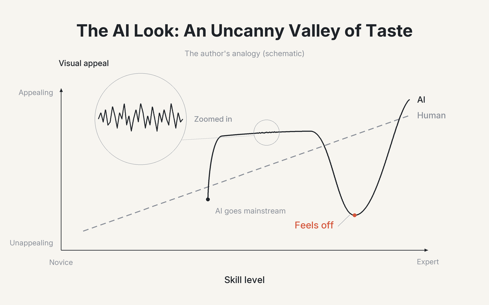
Here is how to read the AI line in the chart. It doesn't climb up from the beginner level like a person does. For the first part of the chart, it isn't there at all. At about 40 percent, it enters the public eye. When it first appears, it is actually worse overall than a person at the same level. But then it shoots up, and that is what everyone sees now: 80 or 90 percent right from the start, and more professional-looking than most people who haven't practiced.
After that comes a long, flat stretch that looks stable. But if you zoom in, it isn't flat. It goes up and down like the stock market, good one moment and bad the next.
Later it falls into the valley, which is the AI look. At the end, in the expert range, it shoots up again and looks like it passes people. The human line, the dashed one, keeps going up the whole time, with no valley.
A surprising amount of taste can be explained like this. But ask people who only make things, and they'll tell you it's all gut feeling.
3Can taste be explained?
So can taste be explained? Or, in graphic design, can "good-looking" really be measured?
People in fashion design or traditional fine art may say no. But people who build UIs and software today will find, if they really look at the research, that a lot of it can be calculated.
Continuous Corners
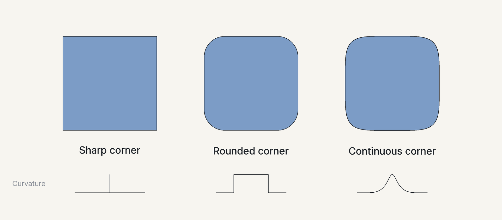
Take rounded rectangles. A normal rounded corner is a straight line joined to a quarter circle. At the joint, the bend (its curvature) jumps from zero all at once. The continuous corners Apple uses let the bend grow slowly, so they look smoother. You can write this as a formula with parameters:
Formula: In math there is a curve called the superellipse,
. The larger n is, the more square it gets.
Parameters: Early on, people tried to fit Apple's icons with n = 5. It was very close, but not exact. Later, Figma made its own version: Each corner uses two Bézier curves with a circle arc between them. With smoothing set to 60%, you get almost exactly the iOS shape.
Optical Compensation
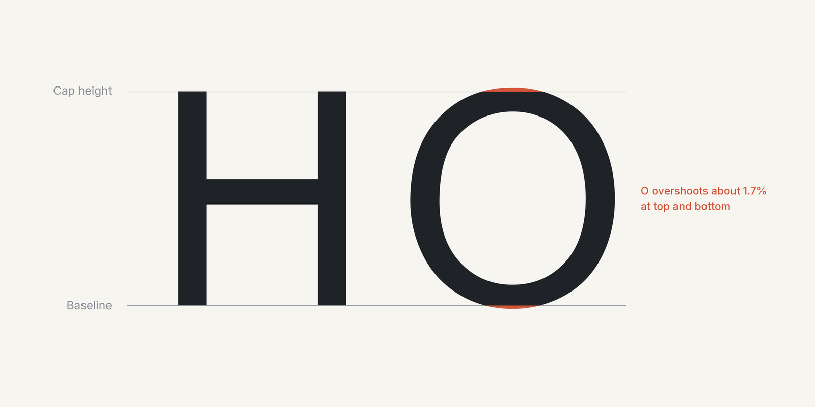
Fonts work the same way. In English fonts, a round letter like O has to go a little above and below a square letter like H to look the same height. This is called overshoot. How much? People have measured it:
Study: Peter Karow, a pioneer of digital fonts, tested 130 people. A circle had to be about 3% bigger across than a square's side before people felt the two were the same size. That is about 1.5% at the top and 1.5% at the bottom.
My measurement: I carefully measured six common English fonts on my own computer. O goes 1% to 2.4% past H at the top and bottom. In Arial it is 1.7%.
Karow himself said these numbers are only averages. Every font is a little different, and in the end an experienced type designer has to decide.
Graphic designers used to say you just adjust it by eye. But with math, if you count the white space on both sides of each letter, you can build a model that sets the spacing for you. The designer only needs to check it at the end.
An Engineer's View
But do we need to calculate all this? To answer that, let's look at it the way engineers do. I studied electrical engineering. In school, every theory class had us work through the full Maxwell's equations. We had to work out every term and leave nothing out. But in real industry work, the math was completely different. First you find which term matters most. Then you drop everything that is 10 times smaller, and you're done in a few steps.
As a student I didn't understand this. Wouldn't the answer be wrong? Only after a few years of engineering work did I get it: In engineering, you only need the error to be small enough not to change the result.
Graphic design works the same way. Design is made for human eyes. If the eye can't see a difference, it doesn't matter how carefully you calculate it.
So can taste be explained? Yes. But in the past, the math took too long, so in practice nobody needed to go past the decimal point. Now things are a bit different. Let me use myself as an example.
4How an unusual engineer does design
I trained as an engineer for a long time. I did a bachelor's and then a master's in electrical engineering, and after graduating I spent five years managing the electrical systems of a hospital. But I have always hated being called "an engineering type." I have always had a creative heart. I have loved design, and even art, since middle school.
I just didn't start learning as a kid, and to be honest I don't have much creative talent. I can't even out-meme anyone on the internet. Later, when I studied graphic design and drawing, I found that many people in film, creative work, and drawing have all kinds of gifts. For some of them, even something like a physical disability becomes a strength that nobody else can match.
I don't have that.
But I have also noticed that in our community, and for most people really, most of us are more like me. If that is true, then some things can be compared, learned, and discussed. They are not out of reach.
I always wanted to learn drawing and design. I kept learning and stayed interested. But when it was time to make something myself, I could never start.
It wasn't only that my skills weren't good enough. I also really didn't like spending time on small details. I talked about this in episode 5 of my podcast, Bu Xia Bu Shang (In-Between), which never really took off.
In short, back then none of this technology existed, and my parents didn't work in this field, so even when I wanted to learn, there was no way to.
5No place to learn, until AI came along
For example, learning to draw back then cost a lot of money. I bought drawing tablets and all kinds of drawing tools. Those weren't too expensive, and my family supported me. But after I bought them, nobody taught me. A teacher was very expensive, and I was too embarrassed to ask my parents for the money.
So I could only practice on my own. And practicing alone, to put it in today's words, I didn't know the basic principles. I didn't know you should start big and then go small, start with the overall shape and then the details, and build the frame and structure first. Instead I really worked pixel by pixel, like a Perler bead project, starting from the first square of the first row, one square at a time, one pixel at a time. Of course I couldn't keep going for long.
Only later, when the internet grew and online classes appeared, did I finally get the chance to learn on my own. The first teacher who taught me gave me this method:
First, finish a whole drawing. Then find your weakest skill and bring it up to about the same level as the others. Then start the next round.
The Same Logic
Later, after AI took off, I noticed something. Everything I had learned about beauty and design over the past 10 or 20 years, especially design principles, followed one complete and similar logic. Interior and landscape design at first, then drawing, photography, video editing, and motion design later: The more I learned, the more true this was. So after AI arrived, I started to see a lot in common.
The three small markers in the chart, the dot, the triangle, and the square, are the centres of the circles. They never move. Only the edges change. These fields never had completely different logic. The small light red area in the middle is what they share. It was always there, just small. Later, as I learned each field more widely, each edge grew outward, the shared part grew too, and now the three circles almost cover each other.
At first it looks like they are moving closer. Really, each one is just getting bigger.
At the end of the animation, I scale "Early on" up to about the same overall size as "Now" and compare them again. The three earlier circles are still far apart, while now they almost sit on top of each other. These fields once felt far apart because each of them was still small. The distance between the centres never changed.
I used visual design as my example, but this works in many other areas. In engineering, for example, between electrical, electronic, and mechanical work, or between different building trades. Or between programmers and UI designers.
And especially in big tech companies right now, people say different roles are taking each other's work: designers, developers, project managers, even business development. To me, it is the same model as the chart above. Nobody is moving toward anybody. Everyone's edges are growing outward until they almost overlap. The lines between jobs are actually blurry. The methods are different, but the logic is the same.
6So close, but not quite
Back to the AI look. Earlier I talked about the bones. When the bones are wrong, you can name the problem, and AI can fix it once you tell it how. But even when the bones are fixed, it still looks close, but not quite.
That chart is the broad picture. Look closer and the line doesn't just shoot up and stop. It's more like the same thing happening again and again. AI catches one kind of beauty, that kind becomes common, people's eyes move on, and the line dips a little. So the two lines stay tangled and keep getting closer. This is only my sketch, and it may not be accurate.
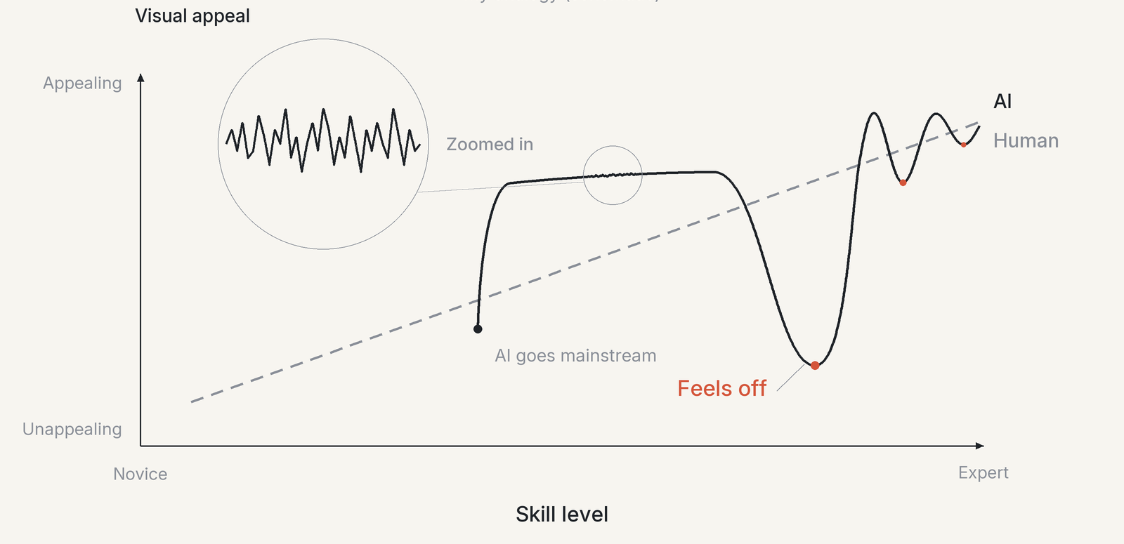
Why? Because AI is a system that never makes mistakes, always follows the rules, and copies you. That is also why robots in the uncanny valley are creepy. They try to copy you, and they are like you in every way, but they never break a single rule. So they feel like they're missing a spark, that certain je ne sais quoi.
AI Writing Has the Same Problem
When I got to this point, I remembered that our community had talked about similar ideas before, so let me compare them here. What follows is what I took from those posts, not necessarily what the writers meant.
The first one was put together by AI: Where Does the "AI Flavour" in Writing Come From? (title translated). It says that in Chinese written by AI, every word is Chinese, but the structure of each sentence is English, so the whole text feels a little off. "The skeleton of the sentence stays English; only the skin is changed to Chinese words." That is almost what I mean by "the skin is right, but the bones are a mess." AI's Chinese reads like it was translated back from English: Chinese skin on English bones, so the whole thing feels wrong.
The post also says that once you see this, the problem stops being a vague feeling about language and becomes a clear technical task. That is the same as what I said: Once you can name the cause, you can give it to AI to fix.
The second one is by Jay How: From Mr. Meeseeks to AI Creation: Why "Removing the AI Flavour" Is a False Problem (title translated). Jay compares AI to Mr. Meeseeks from Rick and Morty: no self, no taste, no point of view, just something that carries out orders. So with the same skill and the same model, how good the result is depends on the person pressing the button. This matches what I said about AI never breaking a rule and missing that spark. It's the letter versus the spirit: AI follows the letter perfectly, but the spirit never makes it across.
What AI Can Still Learn
Where I'm different: I'm not as pessimistic as Jay. Like I said about drawing, people who study the body don't need to start from the skeleton and rebuild the blood vessels, fat, and skin layer by layer. It is enough to roughly know the reasons and roughly get them right. AI can learn the bones the same way.
As for the spark, right now it seems AI can't fix it, and only people can bring it. But that may not be true forever. Generative models already have some randomness built in. For example, language models have a setting called temperature. Turn it up and the output loosens up. The problem is that this randomness is spread everywhere. The model doesn't yet know where it should break the rules. Maybe one day, once it learns to make a few happy little accidents, as Bob Ross would say, with some judgment about where they go, the spark will be there. I'm honestly not sure about this one.
Outside the community, people have said similar things. The design website Vandelay wrote that interfaces made by AI have their own uncanny valley: They look polished at first but feel awkward as soon as you use them.
And the portrait painter Laura King noticed that AI paints hair, skin, and background all with the same detail, so the eye doesn't know where to look. What Laura King describes is really the same as what I said earlier: One frame can only have one centre.
Final thoughts
One more old Chinese saying before I go: You can paint a tiger's skin, but not its bones; you can know a person's face, but not their heart. Skin, bones, and heart: AI has the skin down, can learn the bones once someone explains them, and the heart, for now, still has to come from us.
If any of these ideas or stories meant something to you, or if you think I got something wrong or want to add something, I'd love to hear from you on the Contact page. We can look for the reasons together, or see if there is a better way to sum this up, a pattern, or a deeper cause.
Updates
- Added four section headings to make the piece easier to skim.
- The title image was redrawn: The AI look curve now has two smaller valleys after the big one.
- Section 1 now shows the uncanny valley and the AI look curves side by side.
- “So close, but not quite” adds a paragraph and a chart on how the two lines keep repeating and draw closer, and “passes people” became “looks like it passes people”.
- Section 2 adds a line about Chinese painting after the point on makeup, and puts beauty of the skin and beauty of the bones in italics where they are defined.
- The closing section now opens with an old Chinese saying about painting a tiger’s skin but not its bones.
- The “(members’ area)” labels after two cited articles were removed.